UXLx 2024 — Wrap Up
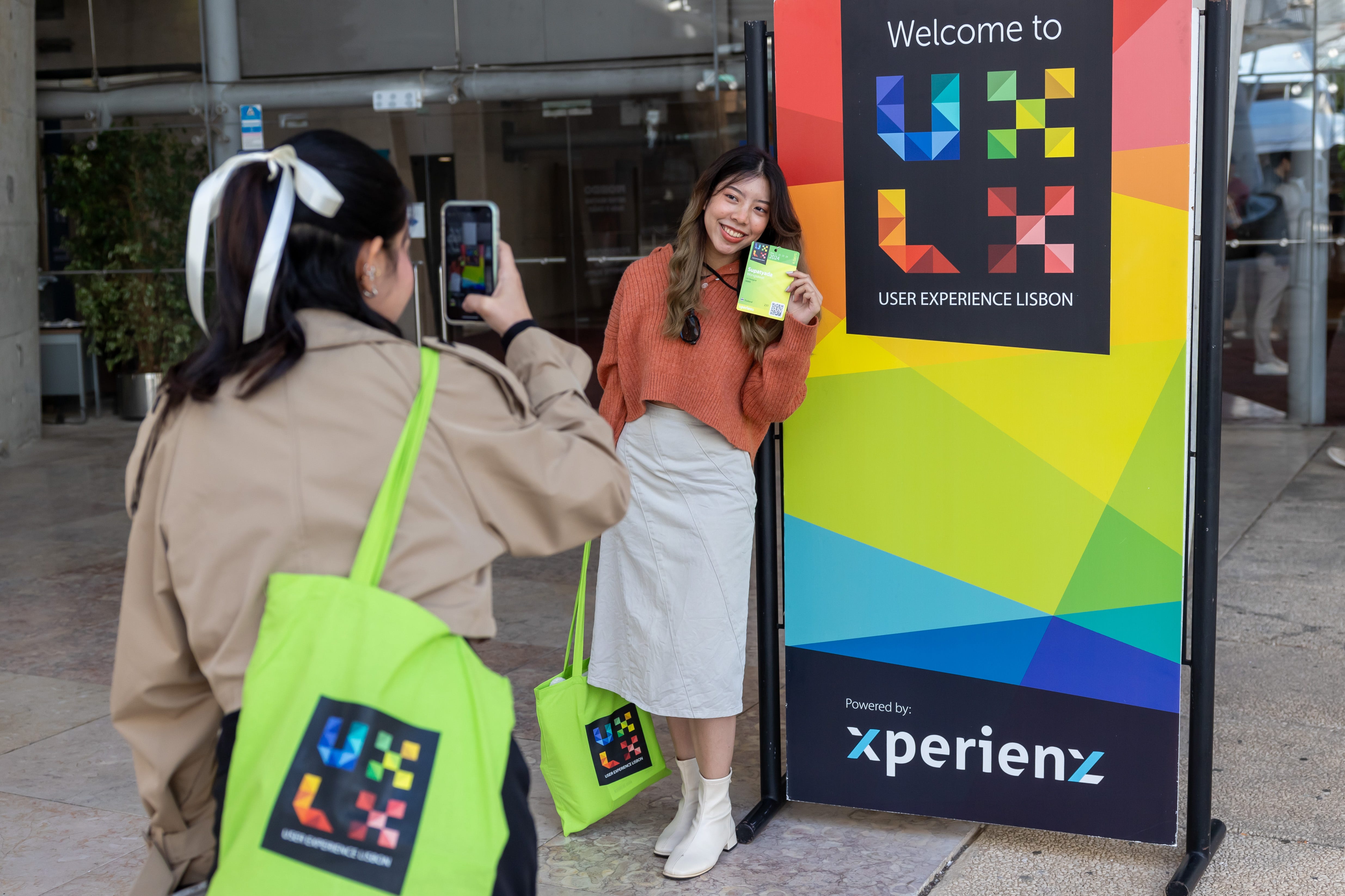
From 21 to 24 May, the roads of 500 UXers from 38 countries (and 5 continents! 🗺️) led to the gorgeous and sunny Lisbon. Their common goal? Soak in new knowledge, strengthen their skillset and refresh their inspiration.
In store we had 4 days of intensive and hands-on UX training that included 22 workshops, a full day of talks and plenty of moments to connect with peers from all over the world.
Whether you missed UXLx 2024, want to revisit what you learned or are curious about that workshop you couldn’t fit in your schedule, just read through this summary.
🤝 UXLx is always a place of collaboration and that extends to this wrap-up article. Feel free to highlight, add any other takeaways we might have missed, and share what resonated the most with you.
21 MAY · FULL-DAY WORKSHOPS
- Supercharged AI Design Methods & Techniques, Greg Aper
- Solving Complex Problems with Systems Mapping, Hannah Härtwich
22 MAY · 10 HALF-DAY WORKSHOPS
🕘 Morning:
- Laying a Foundation for Effective Design Teams, Aaron Irizarry
- Strategic Product Research, Danielle Green
- Inclusive Design: Creating a Bias-Informed Practice, David Dylan Thomas
- Auditing Design Systems for Accessibility, Anna Cook
- Service Safari, Flaminia Del Conte
🕑 Afternoon:
- UX for AI: A Framework for Product Design, Greg Nudelman
- Systems Thinking for UX Design: Navigating Complexity with Confidence, Deirdre Cerminaro
- Getting the Measure of UX Content, Relly Annett-Baker
- Designing Services with AI, Titta Jylkäs
- Taking DesignOps to the Next Level, Jenny Price
23 MAY · 10 HALF-DAY WORKSHOPS
🕘 Morning:
- Behaviour Thinking: Decoding Behaviour in UX Research, Lauren Alys Kelly
- Designing Services with AI, Titta Jylkäs (2nd run)
- Content Modelling: The Translation Layer Between Teams, Meghan Casey
- Auditing Design Systems for Accessibility, Anna Cook (2nd run)
- Taking DesignOps to the Next Level, Jenny Price (2nd run)
🕑 Afternoon:
- New Techniques for Designing for AI, Dan Saffer
- Unlock the Power of AI in User Research, Nick Fine
- Systems Thinking for UX Design: Navigating Complexity with Confidence, Deirdre Cerminaro (2nd run)
- Design System Clinic, Stephen Hay
- Accessibility as a Design Tool: Beyond Compliance to Innovation, Charlie Triplett
21 MAY · FULL-DAY WORKSHOPS
Supercharged AI Design Methods & Techniques by Greg Aper

In Greg Aper’s workshop we explored and tried out next-AI design techniques with the help of an AI design exemplar project.
One of the first interesting ideas shared was the need for us to prepare our mind to engage with generative AI. We must not see AI as a superficial shortcut for design and can’t measure AI versus human output. Proficiency in AI is decided by EQ (emotional intelligence), not IQ. Some emotional intelligence traits include being patient, imaginative and curious.
“Use AI to find questions, not answers.”
Greg walked us through ChatGPT and Midjourney’s basic features and we also had a quick look at other AI design tools.
We covered several LLM prompt engineering techniques:
- Role-playing prompts — setting up the LLM to role-play an entity for a single question or a single chat;
- Iterative streamlining — making slight changes in a prompt in order to fine tune the response;
- Formatting template — for the LLM to follow in its response;
- Adding examples — of the writing style, level of detail, and length of responses, which help to provide high-precision control of the output;
- Explanations — constructing prompts that include requests for explanations of responses and reasoning;
- Prompt chaining — constructing a pre-engineered sequence of prompts to automate a specific task.
We explored some generative AI design advanced techniques, including:
- Creating design-centric GPTs — can be constructed with instructions to assist with a wide range of design tasks, and be set up in specific roles;
- Superframeworks — to organise both human- and AI-generated outputs of a project;
- Using ChatGPT to create customer profiles & user personas — asking your LLM to be a creative writer and create a “Day in the Life” short story;
- Conducting AI interviews with ChatGPT voice — having a verbal “give & take” emphasises the detailed, emotive aspects of a conversation;
- Using Midjourney to create persona imagery — with persona info and ‘Day in the Life’ snippets;
- Using AI tools to create wireframes — narrative wireframes are text descriptions of the global navigation icons/buttons and a content description for each scene.

Solving Complex Problems with Systems Mapping by Hannah Härtwich

What is a system? Any time components interact with each other in a way that results in a behaviour that is greater than the sum of the parts, they form a system.
What is systems mapping? A systems map is a visualisation that helps us to think about how a system would react to changes in its structure or the level of variables.
For what purposes can systems mapping be used?
- Intervention: Finding places and ways to intervene, to change the system in the desired direction;
- Impact assessment: Assessing the impact of changes on the system;
- Coordination: Coordinating tasks and resource flows in a way that they support and reinforce each other;
- Communication: Communicating complexity and getting others on board to take action.
What are variables? Things that can increase or decrease over time.
We started out the workshop with a “living loops” exercise to understand and experience the concepts of variables, influence and feedback loops.
For the hands-on/group work part of the workshop, we had to choose a design project to work with. First, we had to determine the key stakeholders (Who is influenced by the design of this?) and their desires in relation to the chosen design project (What do they care about that is influenced by this?). Then, we had to explore how these desires were related to each other and where there are agreements or disagreements.
The connected desires were then used to craft our systems map and identify possible interventions that would benefit the whole system.

Welcome Party @ Esplanando 🍻☀️🌳


A short walk along the river led us to a relaxing terrace overlooking the Tagus, and both Vasco da Gama bridge and tower (Portugal’s tallest building). After a day of intensive learning, nothing better than chilling and having some drinks with peers. 😎🍻
22 MAY · 10 HALF-DAY WORKSHOPS
Laying a Foundation for Effective Design Teams by Aaron Irizarry
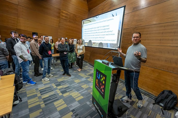
For the first part of the workshop, Aaron provided some insights into setting a foundation for successful team outcomes by creating a foundation for the team to do their best work.
How can we go about creating a foundation for our teams to do their best work?
- Allow the team to take informed risks, make honest mistakes and learn from them, thus encouraging creativity and innovation;
- Foster psychological safety;
- Build an environment based on trust. High-trust companies report less stress, more energy, higher productivity, more engagement;
“Being an emotionally intelligent leader is eff-ing good for business!”
1st ACTIVITY: The first hands-on activity was meant to help us build some self-awareness through understanding our working styles, and also understand others’ preferences in order to open the door for empathy.
🧭 We had to place ourselves in one of the four compass points, considering the way we work with others on our teams:
- ⬆️ North: Acting “Let’s do it”. Likes to act, try things, plunge in.
- ⬇️ South: Caring. Likes to know that everyone’s feelings have been taken into consideration before acting.
- ➡️ East: Speculating. Likes to look at the big picture and the possibilities before acting.
- ⬅️ West: Attention to detail. Likes to know the who, what, where, when before acting.
As a group, we then discussed the strengths and limitations of our style, the style we find most difficult to work with, what we value about the other styles.
After the break, Aaron walked us through how to build a shared vision that supports autonomy in decision-making and execution for each member of our team.
So how do we create a shared vision?
- The team must understand our expectations, the importance of those expectations, and the fact that we welcome mistakes in pursuit of meeting them;
- Providing clear objectives, and setting guardrails for how they get there, we set them on the path to successful outcomes;
- Positioning teams to be connected to a singular, guiding, purpose, that allows them to make decisions on their own;
- Work from a position of trust.
2nd ACTIVITY: The second activity was all about creating a team vision, using our own team or context. We should consider what we would like our team to be known for, what is the impact that we want the team to have, and how will we know that we have been successful in executing on the vision.
For the final part of the workshop, we talked about the importance of building strong partnerships with cross-functional teams. We must establish strong internal relationships, that are mostly based on trust, and build shared accountability to one another and our teams.
3rd ACTIVITY: For the last activity we had to create a partner relationship charter. Aaron walked us through the best practices and then we had the opportunity to work through our charter based on our team or context.
Strategic Product Research by Danielle Green

We started by delving into STRATEGY, defining what it is and thinking about what’s our team strategy.
- Vision: the future state or overall direction your product is headed. — How would you summarise the current Product Vision?
- Strategy: the approach or high-level plan for achieving your goals — How would you summarise the current Product Strategy?
- If people on the team described Product Vision and Strategy, how consistent would the answers be? Very inconsistent? Or very consistent?
FRAMEWORK — Strategic Product Research provides the key information for making successful strategic decisions. We need 4 strategic vantage points:
- Need: Can encompass the problem to solve or the desired state people can achieve.
- What measurable effect does the need/problem produce in the world?
- What conditions produce the most extreme version of the need?
- How do people perceive the need?
Possible methods: In-depth interviews, diary studies, field research
- People: Those who experience the problem or seek to achieve the desired state and those who influence them
- What characteristics or behaviours are required to experience the need?How prevalent are the requirements in the world?
- What characteristics or behaviours are common among people who experience the need?
- Who else influences the need?
Possible methods: Qualitative surveys, quantitative surveys, in-depth interviews
- Context: The forces, competitors, and situational factors that relate to the people and their needs.
- What factors influence the measurable effect?
- Who else seeks to change the measurable effect? How successful are they? What keeps them from making a bigger impact?
Possible methods: Competitive analysis, quantitative surveys, qualitative surveys
Value: The resources, capabilities, and constraints affecting your ability to meet people’s needs in the context.
- What do people expect of the product?
- What capabilities must the product have to change the measurable effect?
- What resources are available to improve the product’s impact on the measurable effect?
- What constraints exist that keep our product from making a larger impact on the measurable effect?
Possible methods: Concept testing, pricing research, qualitative interviews
DELIVERY — Filling in the Key Competencies with data or comfortable assumptions as a team.

Inclusive Design: Creating a Bias-Informed Practice by David Dylan Thomas

David Dylan Thomas joined us for the 2nd day of UXLx with a workshop to help us come up with systemic ways to mitigate bias in our design process.
The first section gave us a grounding in how bias works and focused on the biases our users have and how to use design and content strategy to mitigate or leverage them for good.
What is cognitive bias? A series of shortcuts our minds take that often help, but sometimes hurt.
Confirmation bias: Bias are extremely difficult to combat because you may not know you have them.
User biases: Your user is making 95% of their decisions below the threshold of conscious thought. The design decisions we make influence those decisions.
Cognitive fluency: The easier/harder it is to read, the easier/harder it is to do.
Then we covered stakeholder biases. Like our users, we must consider that our stakeholders are making 95% of their decisions below the threshold of conscious thought. And our approach influences those decisions. David explored the concepts of buying in, stakeholder inception, and loss aversion.
The final section of the workshop focused on our own biases. Much like or users and stakeholders we are making 95% of our decisions below the threshold of conscious thought. Our approach influences those decisions. David explained the survivorship bias and consistency bias, and what speculative design is.
We got to experience using some of the methods to reduce the harm biases might cause (red team/blue team, ethical goal-setting, etc.) that lead to less-biased outcomes.

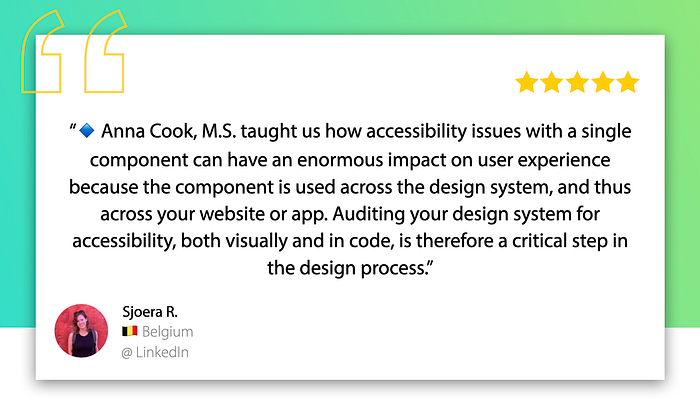
Auditing Design Systems for Accessibility by Anna Cook
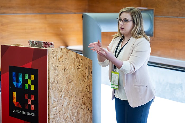
Anna started by explaining the close relation between design systems and accessibility, as they are essential for creating more accessible products at scale. We can’t scale accessibility if there are problems in the system.
Accessibility issues have the power to proliferate throughout the whole experience. The good news is that accessibility fixes in a design system also proliferate.
Accessible design systems empower teams to build more inclusive products.
Then we started exploring how we can set up our design system audit. Basically, auditing is like detective work. 🕵️♀️ Accessibility audits are one way to find and log accessibility issues in so we can document and fix them.
When conducting the audit it’s recommended to use WCAG assessment criteria. The WCAG Quick Reference guide will help us know what to look for and why. WCAG applies different levels of compliance — A (critical), AA (Essential) and AAA (helpful). We must review for A and AA accessibility levels.
There are two audit evaluation methods: automated testing and manual testing. When planning the audit we must consider:
- The accessibility level we want to comply with: A, AA, AAA?
- The goals: What are the objectives of the audit?
- The timeline: How long will we need?
- The team: Who should be involved?
- The process: Automated, manual or both?
- The scope: What components and patterns will be reviewed?
Anna shared a spreadsheet we can use for auditing, where for each issue we register the following: impact of the issue, theme, component/item, WCAG criteria, conformance level, description, fix recommendations, testing method(s), link(s), date captured, notes.
It is advisable to use WCAG for our audits as it makes it easier to link the issues we found to specific guidelines, prioritise issues, provide references for who will fix the issue, and to make it clear to leadership that the issues are related to legitimate guidelines.
Designs, code and documents can be reviewed in our audit.
Not every designer needs to be an accessibility expert. Every design needs to know accessibility matters.
When reviewing designs manually we can use WCAG Quick Reference and Plugins. In design, we must review aspects like colour contrast and usage, content, heading and page titles, link purpose, hover and focus states, forms, layout, media, tab order and bypass blocks, timing and typography.
When reviewing code we should use both automated and manual evaluation methods.
Anna recommended two accessibility testing tools: Accessibility Insights and axe by Deque.
The session also gave us some ideas on how to effectively communicate the results of the audit with team members and leadership, with Anna sharing a presentation template we can use.
Finally, we addressed how accessibility auditing cannot replace feedback from users with disabilities. We must prioritise inclusive research and design and gather direct feedback from disabled users about our products.
Service Safari by Flaminia Del Conte

What is Service Safari? An experiential field trip for individuals/teams to understand and experience services from the customer’s perspective. It’s a qualitative and behavioural research method.
Service safari basis on the idea of experiencing a service first hand rather than letting someone else (a client or customer) explain it to you.
You can use this method both for the service you’re redesigning (to see the whole picture and experience it as different people) and for other services (to compare or get inspiration from other sectors).
Service safari can be useful on different phases of a project:
- Pre-sale phase: to find opportunities for improvement;
- Understand phase: to gain knowledge of your work context;
- Prior to user research: to empathise with user frustrations;
- Before creating a Service Blueprint: to warm-up your team;
- At any point in time: to get a shared understanding with your team.
This method has no recruitment costs and doesn’t require client’s approval of user engagement.
After an introduction about what a service safari is and how to use it, we got to actually experience one. Each group went “into the wild” and experienced different services, collecting observations and insights. Each group had to put themselves in the shoes of different personas. This helps us empathise with our customers and their perspectives.
Then we had to map our observations and identify major pain points in the service experience, reframe the problems into ‘How might we’ statements that help create opportunities, and come up with possible solutions to the problem.

UX for AI: A Framework for Product Design by Greg Nudelman
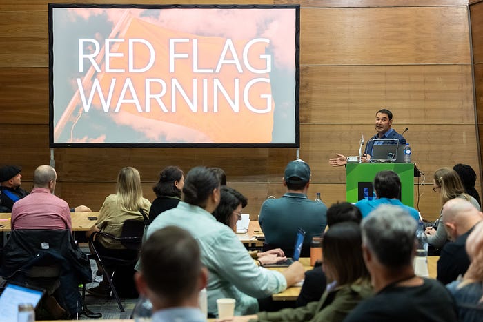
Greg started off with giving us 7 reasons AI projects go wrong. They fail to:
- Pick the right use case — we should use UX methods like contextual inquiry and customer journeys to open new market opportunities for AI;
- Be scrappy;
- Articulate your Vision;
- Weigh real-world outcomes — we should train AI via real-world outcomes, not Data Science Metrics;
- Implement AI-inclusive process — AI MUST be included in the process, centered on users. Continuous rapid adjustment is the key;
- Account for AI bias — (Assume that) All AI is biased and figure out how that bias will impact the experience;
- Establish AI guardrails.
We moved on with learning several UX Design skills that with help us lead our next AI project:
- Use-case Storyboards — use to communicate your product vision to users and stakeholders. If you can’t tell a compelling story, there’s most likely a lack of demand for the product or service, and you don’t have a chance;
- Digital Twin — creating a digital replica of the physical components of the system; it’s an exercise to figure out what is essential and not essential to include in the model and nail down the use cases the model will deliver;
- AI Copilot Design — designing custom Copilot for our projects;
- Using AI Design Patterns for forecasting and anomaly detection;
- Disciplined Brainstorming;
- Testing your AI Product Prototype — Some tips shared: Minimum Viable Prototype is both a design and a prototype. Treat participants like experience partners and encourage them to brainstorm and co-create with you. Jump into testing as soon as you have 3–4 screens completed, and build up the rest of functionality from the customer feedback.

Systems Thinking for UX Design: Navigating Complexity with Confidence by Deirdre Cerminaro
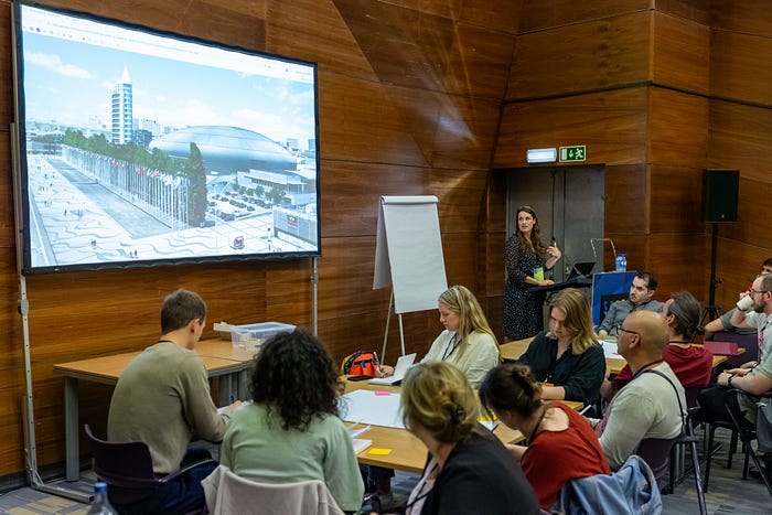
Today’s products, services, and organisations exist in a world that is increasingly interconnected. Systems thinking is a mindset, methodology, and critical leadership skill for making better decisions and managing change in the face of complexity.
Sometimes, we only consider systems at an abstract level, which can cause us to lose sight of people’s lived experiences. Or we focus only on people, while missing the larger dynamics at play.
By combining the analytical tools of systems thinking with the creative methods of user-centered design, we can understand problems more holistically, spot the most impactful opportunities, and tangibly experiment and build more effective solutions.
A systems map lays out all the relationships and interactions between stakeholders in a given system. There are several types of systems maps:
- Process maps: Visualise linear process and interdependencies;
- Problem maps: Examine behaviours to uncover root causes;
- Network maps: Visualise non-linear connections and relationships.
A systems map is useful tool that you can use for understanding and redesigning systems. It can help us organise thoughts, see things from a new perspective, make our mental models visible to each other, and create alignment.
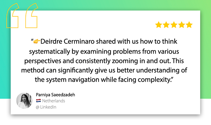
Deidre walked us through the mindset of systems thinkers — when in doubt zoom in and out. Zooming out to visualise the bigger picture and identify where we want to zoom in (a question, something to learn more or experiment).
We then had the chance to get hands-on and practice visualising and exploring systems through different techniques of systems mapping.
We finally explored some methods for viewing a system through different lenses and perspectives to uncover new solutions. This included finding leverage points — a place within a system where small changes can have large effects.
Getting the Measure of UX Content by Relly Annett-Baker
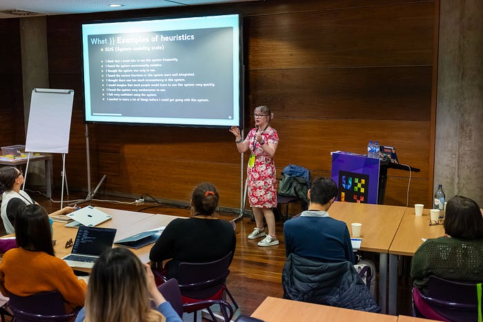
What is good content? Most people cannot identify good content unless they have a direct side-by-side comparison.
Getting a baseline: by getting super-crystal-clear on what “good content” (for you, your team, other teams, your product and your company), and creating content heuristics.
Content research experiments: using the heuristics to focus and refine your research plan, to measure content effectiveness, and get your baseline; use your heuristics to run simple experiments to prove your hypotheses and get your numbers.
Relly walked us through a series of content research lenses:
- CLARITY — Do users clearly understand a message, feature, product, even a whole campaign? If users are tripping up on particular words or mental models, you can identify these, and test and find alternatives;
- COMPREHENSION — How thoroughly does your audience understands features and products, and can apply that knowledge? Can they explain what’s going on in their own words? Is there guessing? How closely does that language mirror your product? How does a user’s understanding match up to your stakeholder/SMEs?;
- NAMING — Naming things is the second-hardest thing in all over tech and so it has the most churn. Stakeholders over-index on the importance of names. Combining a before-and-after walkthrough of a prototype and a list of names is a great start. Share user thoughts directly with stakeholders;
- PREFERENCE (OR ENGAGEMENT) — ask “tell my WHY you like A over B”. However we should remember what users are telling you might be great for them as individuals but poor for the systems of users;
- AUDIENCE SEGMENT — research can be done by segmentation to see differences between, for example, power users and new users;
- SENTIMENT — What specific phrases excite / confuse / frustrate / create no reaction? How would they describe the new feature? How does this compare to other audience segments and your stakeholders?
We also looked at making the case to measure content, and presenting our findings to stakeholders. Since it’s highly unlikely they will read our research deck, we must be able to highlight research insights, and link related ones.
We did a number of exercises such as identifying problems and matching heuristics, creating a content scorecard, and explored exercises we can do with stakeholders to help them understand our findings.
“Be wildly curious about everything.”

Designing Services with AI by Titta Jylkäs

Titta Jylkäs workshop focused on different AI functionalities that can improve service experiences when implemented in service systems.
We did a practical exercise to get a feel of how to form user journeys and service system designs incorporating AI in them. Titta presented us the AI design cards method, that include:
- AI Functionalities — Predictions, Pattern recognition, Data mining, Robotics, Conversations, Generative design;
- Types of Data — Structured data (clustered data, logged data) and Unstructured data (text data, audio data, visual data);
- Ethics and Sustainability — AI ethics and Digital sustainability.
For the exercise we were given a service scenario and had the challenge of figuring out how AI could improve the service experience in the future. We had to identify:
- Data sources — What kind of data is available for the service? What kind of data is generated? What kind of data is collected?
- Technology — What are the actions where AI is involved in the service process?
- Interface — How would you provide the output to users? How do you collect the needed information? Through which kind of channels?
- Ethics — How would you design for, or mitigate, ethical issues involved with your service?
Taking DesignOps to the Next Level by Jenny Price
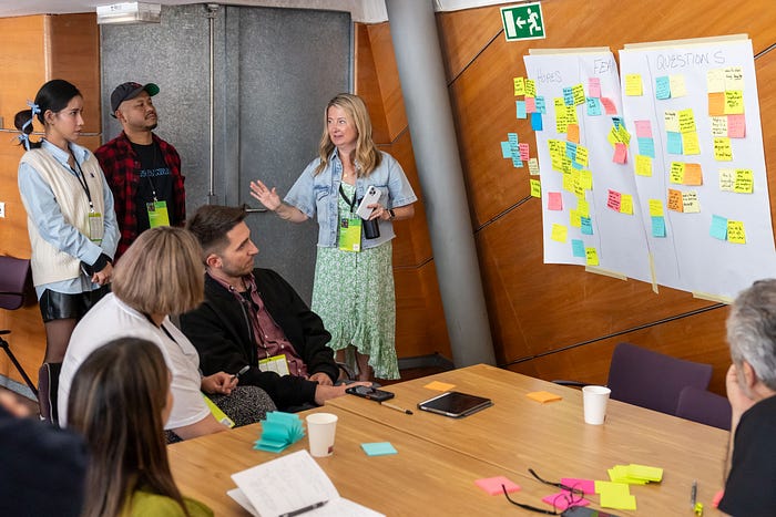
In Jenny Price’s workshop we explored our team’s DesignOps needs, and collaborated with experts and colleagues to define practical next steps to take in improving design quality, delivery, productivity, value to the business, and outcomes. Co-designing ways in which you can better support and build sustainable design team health through elevating the practice of world-class design, team culture, and operational excellence within our own organisation.
Jenny led us through a series of IBM Design Thinking exercises to help us bring back ideas for building and scaling DesignOps within our core team, wider design program, and at the organisational level.
It was a hands-on, team-based workshop, where we had the opportunity to assess and ideate on our organisation’s approach to scaling DesignOps by:
- Exploring strategies for advancing DesignOps across our organisation;
- Engaging with other DesignOps and Design Program leaders who are interested in solving for pain-points;
- Ideating using several IBM Design Thinking exercises;
- Selecting concepts that will be the most useful for our organisation;
- Developing a 30–60–90 day roadmap specifically for our organisation to explore further iteration;
- Learning more about DesignOps resources, methodologies, and applications.
23 MAY · 10 HALF-DAY WORKSHOPS
Behaviour Thinking: Decoding Behaviour in UX Research by Lauren Alys Kelly
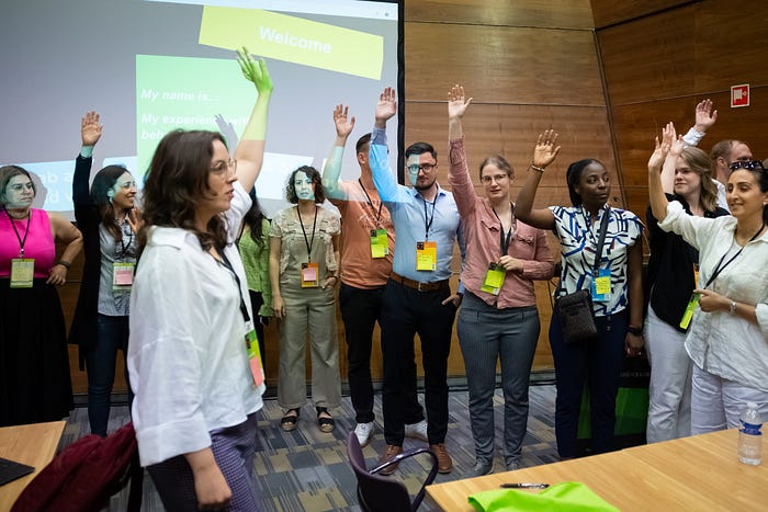
Lauren started with an introduction to the concept of Behaviour Thinking and its relevance in enhancing UX research.
We can understand behaviour by asking 2 questions:
- Are people ready?
- Are people influenced?
There are 3 stages of readiness:
- Direct — beneath the surface
- Shift — something that has changed, the momentum
- Act — sustainability of behaviours
And 3 layers of influence:
- Me — personal decisions and actions
- We — how people interact with others
- Oversee — the influence of the environment
If we overlap both questions we get The Drive Grid — a framework to reveal what drives user behaviour, and basically gives us 9 reasons why people do things.
For the hands-on part of the workshops we did a practical observation exercise in groups where we were given a scenario and had to conduct real-time behaviour analysis in the conference environment. Each sub-team focused on one driver — ‘Me’, ‘We’ or ‘Oversee’ — and had to observe the way drivers may be influencing people. After that we had to share the insights gathered and discuss which drivers might be influencing the behaviour across all layers. Finally, we had to use the Drive Detector, a tool to assess impact and find out what’s important:
- Green: The driver has a strong impact → Research
- Amber: Some or uncertain impact → Requires cautious exploration
- Red: The driver has no impact → Keep an eye on as contexts may change
Behaviour thinking empowers us to identify and interpret complex user behaviours, see the hidden unknowns and use insights to begin crafting targeted research strategies.

Content Modelling: The Translation Layer Between Teams by Meghan Casey
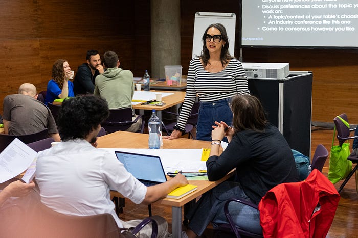
As part of our editorial strategy, we must define the why, the who, and the what for. So for the first activity we had to fill in each open-ended prompt:
- We see an opportunity to … with content for… so they can…
And consolidate it into a single statement.
Then we have to prioritise content — define what content to provide and how important it is to your users and your business.
For the activity, we had to brainstorm user stories and pull out content needs/topics from those stories. Then we had to assess its value — high business and user value, high business value or high user value.
Meghan explained how content modelling creates a better experience for both the people who read the content and the people who make the content:
- User experience — how people interact with and engage with your content everywhere it is;
- Author experience — the interface people who work with content use to create and relate content for users;
- Content model — documents the nitty gritty details about content types and components and how they relate to each other.
This results in Structured Content, where you break down repeatable content patterns (or templates) into smaller parts or components that can be authored within a template or as a separate content item and used across web pages, applications, and other platforms.
Modelling content is important:
- to provide the requirements for building an easy and intuitive author experience.
- to define how content is structured and stored, which provides the backbone to flexible and adaptable content delivery.
- because it’s a collaboration, conversation, and understanding tool between teams.
For the last part of the workshop we got to model some content, where we had to identify content types and components.
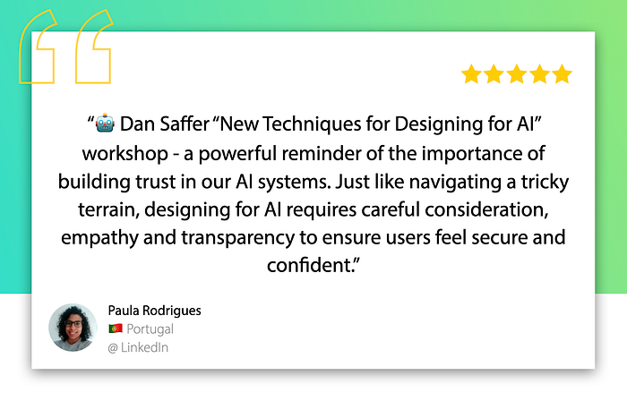
New Techniques for Designing for AI by Dan Saffer
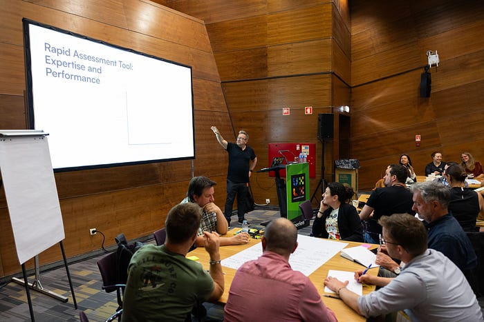
Companies are hunting in the wrong place for AI innovation. A place that’s technically challenging, has high accuracy and high risk when wrong. However, the AI sweet spot is where something is very buildable and desirable. We’ve been witnessing how some of the greatest benefits of AI are from narrow AI, focused on everyday tasks (i.e. translations, spam and bot detection, recommendations, predictive text).
The best AI projects have 3 components:
- High value to both users and the organisation;
- Low risk;
- Only require moderate technical performance.
The traditional user-centered design process alone doesn’t work well for AI. We need:
- User-centered design — evaluate the benefit and desirability for the user (or risk building AI to address a very small, nonexistent problem);
- Service design — evaluate the benefit for the organisation;
- Matchmaking — map technological capabilities to human activities, and identify domains that might benefit from the tech.
What are AI capabilities? Basic actions or effects a technology can achieve; it’s the what, not the how; captured as action verbs, not technical terms (i.e. Uber — plot the best route, estimate cost, etc.).
For the fist exercise of the workshop we had to open a major app on our phone/laptop, find AI features in them, and figure out the capability behind it.
We also did some exercises where we used matchmaking and ranking to find the best uses of different AI technologies.
Matchmaking: The Three Cs — Capability + Context = Concept
We had to rate each concept across technical, financial, and desirability criteria. For an AI project to be successful, it has to be technically feasible, financially viable, and valuable to users.
We went through the concept of Explainability and how the right level of explanation is key to helping users understand how the system works. Explainability is inherently liked with trust. Once users have clear mental models of the system’s capabilities and limits, they can understand how and when to trust it to help accomplish their goals.
We finished with Consequence Scanning to identify risks (and attempt to overcome them).
Unlock the Power of AI in User Research by Nick Fine
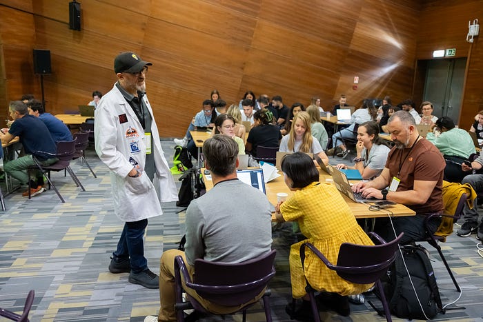
Nick Fine walked us through the AISUR (AI Supported User Research) — a framework for user researchers to use AI effectively and safely. It’s divided in 7 steps:
- PLAN — research questions informs choice of methodology; planning, designing and conducting the research so that it is optimised for AI analysis, and you can get the best outcomes from using GenerativeAI to perform analytical tasks;
- CREATE — interview script, discussion guide, survey, task based script; structure interview scripts for transcription analysis, and try to stick to script for main questions; by making it easier for the AI, you get improved chances of valid output; if you miss out the core questions, there is an increased risk that AI will make up the missing questions (AI hallucinations);
- DEPLOY — do the research, get the data;
- PROTECT — remove personal identifiable information and anonymise because publicly available AI services, especially free ones, use the interaction data to further develop and train the underlying AI models;
- CHUNK — segment into chunks for analysis; the amount of information fed to the AI for analysis can have a direct impact on the validity of the output;
- PROMPT — run prompts against transcript; borrowing prompts comes with risk so we should always test them;
- CHECK — double check output against transcript and/or video with investigatory prompts (1. Probing — to learn more detail | 2. Checking — to challenge validity); use your human intelligence to check the AI for comprehension and accuracy; if you’re spending too much time double checking, then AI is not fit for your research needs.
Nick argued that in a post pandemic time where UXR has become closer to Market Research, with methods like interviews and surveys dominating, the challenge we face is to get behavioural insight.
Humans are far better at understanding the needs of other humans than AI.
You are, and always will be, better at UXR than AI.

Design System Clinic by Stephen Hay
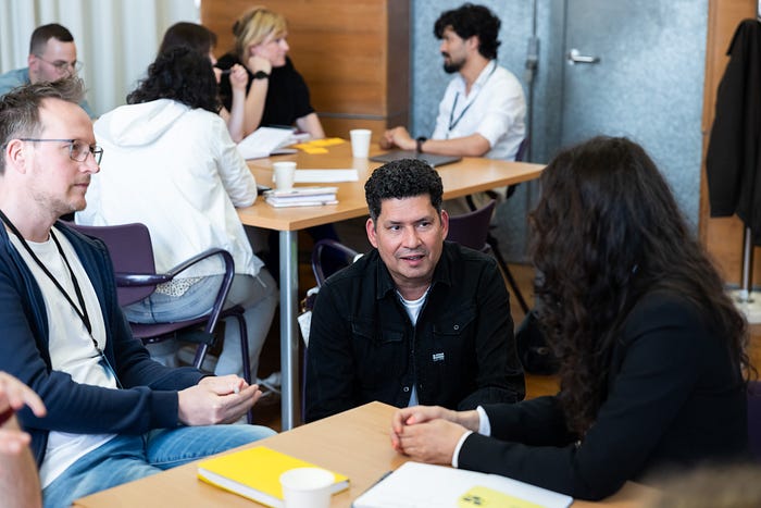
Design systems are never enough. Most design systems and practices focus on components, and although they are necessary, they’re not sufficient. Design systems need to help designers make the right design decisions, and good design decisions need to be fed back into the system.
Using the right components doesn’t ensure good design. Most design systems don’t know about the contexts in which they’re used. Designers need a process that makes room for some experimentation, because they know the context.
Three types of designs:
- Those that use the existing system;
- Those that require changes to (parts of) the system;
- Those that introduce new elements or patterns.
The most valuable design ritual is design review. Two important design review types are:
- “Normal” peer review/critique, zooming into the work itself.
- “Alignment” review, which manifests as a normal review but also involves zooming out to gauge how the work affects the larger whole. Alignment looks for “fit” with the whole and aims to determine what is generically useful enough to become a part of the system.
We can address as many issues as possible during peer review. If something can't be solved during a ritual, then we can approach specific people. The three main escalation questions can help you:
- Is it currently being designed?
- Has it been design and developed, and soon to be deployed?
- It is already in production?
A useful model around design (system) governance integrates design types, rituals, and escalation. It accounts for problems in your own context.
For the hands-on part, we created a governance model and alignment process tailored to our own obstacles through exercises focused on:
- Creating an obstacle map;
- Rituals and tools inventory;
- Escalation paths;
- Model skeleton.
Accessibility as a Design Tool: Beyond Compliance to Innovation by Charlie Triplett

Accessibility is not a requirement. It’s a design tool.
Much like how curb-cuts are a feature that works better for everyone (not just people in wheelchairs), we must also understand the importance of applying accessibility to the digital world.
Charlie started by dispelling some myths related with accessibility:
- Accessibility is not just about a few people. Millions of people in the US live with a disability. Even if you don’t have a permanent and complete disability, we all experience temporary and situational disabilities;
- Accessible products don’t have to be ugly;
- Automated testing tools are not enough to check accessibility (we used the plugin Lighthouse on a website we knew it wasn’t available and got 100%).
We got to understand better each type of disability (motor, vision, hearing, cognitive) and which assistive technology people with disabilities use to navigate the web.
Through a series of exercises, we got to experience how assistive technology work — magnification, using the keyboard to navigate, using a screen reader to hear the UI.
With we didn’t have enough time to cover the best practices when it comes to accessible design, but we could still explore some:
- Content should be read in logical order across the entire page;
- Keep elements vertically stacked and grouped by proximity, specially in form inputs and labels;
- Add structure with headings;
- Adding alt-text to informative images, and assessing whether or not an image is decorative;
- Label icon buttons;
- Link (if it goes somewhere), button (if it does something);
- Don’t use colour has the only means of conveying content.
During the workshop we also learned and practiced how to annotate a UI for development (using Figma), and how to read and apply WCAG guidelines.

24 MAY · TALK’S DAY
Get to know more about the Talks day at UXLx 2024 in the article “UXLx 2024 — Wrap Up — Talks day”.
After Party — Sunset Cruise 🛥️🌅
After soaking in all the knowledge from the workshops and talks at UXLx 2024 it was time to partyyyy! 🎉 This year we booked an exclusive ship for a river cruise at sunset. 🌅
Food, drinks, music, scenic views of Lisbon, amazing sunset, great fellowship. Check, check, check ✔✔✔. All the ingredients reunited to end this edition of UXLx the right way. 🤩
See you next year? 😉



🙌 Last but not least, we’d like to thank…
- … our Silver Sponsors Sixt, and our Partners for their support.
- … our incredible speakers who so passionately shared their knowledge.
- … the hundreds of attendees from all around the world who chose UXLx to help expand their knowledge.
- … our photographer José Goulão for brilliantly capturing the essence of our event.
- … the entire UXLx team who always goes all out to bring the best UX content to sunny Lisbon and give everyone an incredible experience.

