UXLx 2023 — Wrap Up

450+ attendees from 44 countries and 5 continents got together in Lisbon for 4 days of learning valuable skills and inspiration.
This year, the speaker lineup included 19 speakers coming from 7 countries. Their goals were all aligned: teaching how to overcome the current challenges in UX, by providing new tools, and helping UX professionals push their careers ahead.
🛑 UXLx is always a place of collaboration and so can this article be. While we made our best to sum each workshop takeaways, feel free to highlight or add what resonated with you the most in the comments. 🛑
Let’s see how everything went!
23 MAY
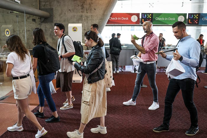
As in previous editions, the first day at UXLx was dedicated to an intensive full-day workshop, with two options to choose from:
Maturing Design Systems by Ben Callahan

There is still a lot of confusion about design systems, and teams are not fully realising the benefits of a systematic design practice. This is why Ben Callahan’s was the ideal workshop for the designers who want or are in the process of building a design system at their organisations.
Ben started by breaking down the design system concepts, reframing how to think about them in a practical and approachable way (The Anatomy of a Design System). This included the four layers of a design system — Foundations, Tokens, Core Systems, Components.
He then explained the four major concepts covered by the Design System Maturity Model: one that goes from discovering and building the right version one (stage 1), to making it easy and obvious to adopt (stage 2), to building a product team and mindset (stage 3), and finally to the point where the organisation sees the system as an influential leader (stage 4).
We saw how a design system’s origin story impacts its path through maturity — Top Down (leadership involved and actively supportive) vs. Grassroots (leadership uninvolved and unsupportive) and deep dived into each stage of the maturity model.
Ben also presented a framework for maturing in a healthy way: a process that circles from Educating, to Engaging and Evolving, and a framework for maintaining stability that bases on Authority (leadership actively supports the design system team and their goal), Value (the system offers true value to those who use it), and Tradition (the system has become “the way we build interfaces”).
For the final part of the workshop, Ben focused on how the culture of an organisation impacts the way you approach creating a sustainable systematic design practice.

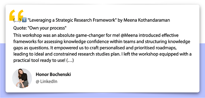
Leveraging a Strategic Research Framework by Meena Kothandaraman


In many organisations, qualitative researchers face a number of challenges in positioning and conducting research studies that result from unarticulated learning needs, lack of transparency in the research effort and misdirection of research services. Those challenges make them fail actual objectives, and ultimately compromise the quality of designs.
To help facing those challenges, Meena’s workshop promised to unpack the power, the practice and the position of research. Here’s some keypoints:
Establish language and process — research should have a consistent structure and be transparent. Meena presented what our five-phase learning process should be:
- ALIGN — organise questions and study intent
- PLAN — recruit and create protocol
- GATHER — capture and debrief data/stories
- ANALYSE — synthesise and deconstruct insights
- APPLY — develop final findings deliverable;
Reflect on beliefs — high confidence knowledge sources; which data and knowledge sources the team believes in, and which should be leveraged;
Document questions — knowledge undocumented is invisible knowledge; facilitate open discussions on learning objectives to streamline research activity for success; using a visual canvas (NCredible Framework) to coach teams on unpacking questions;
Recognise patterns — create transparency and structure;
Design the ideal study — researchers tend not to present ideal study designs for fear of rejection; the ideal study comprises what the study will look like without any constrains (the who, the what, the how, the why);
Flex to a constrain study — teams often have constraints, which might be mindset or mechanic constrains. The ideal study should be reframed according to the constraints applied.
Using a case study as a foundation, we did a series of collaborative exercises in small groups that included the design of an ideal study and then reconfigure it after being given a constrain.
“If you don’t define your work, others will do it for you.”
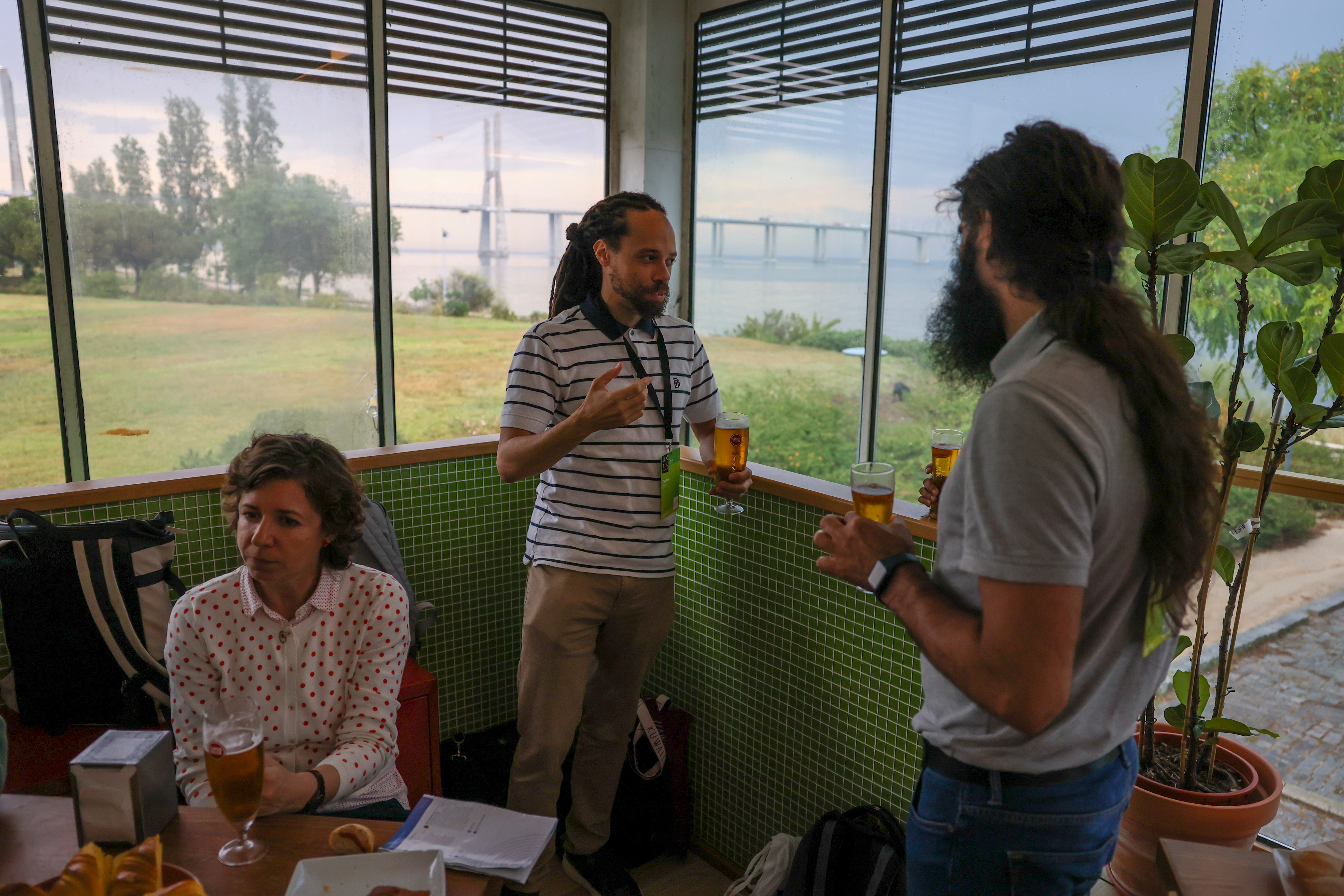
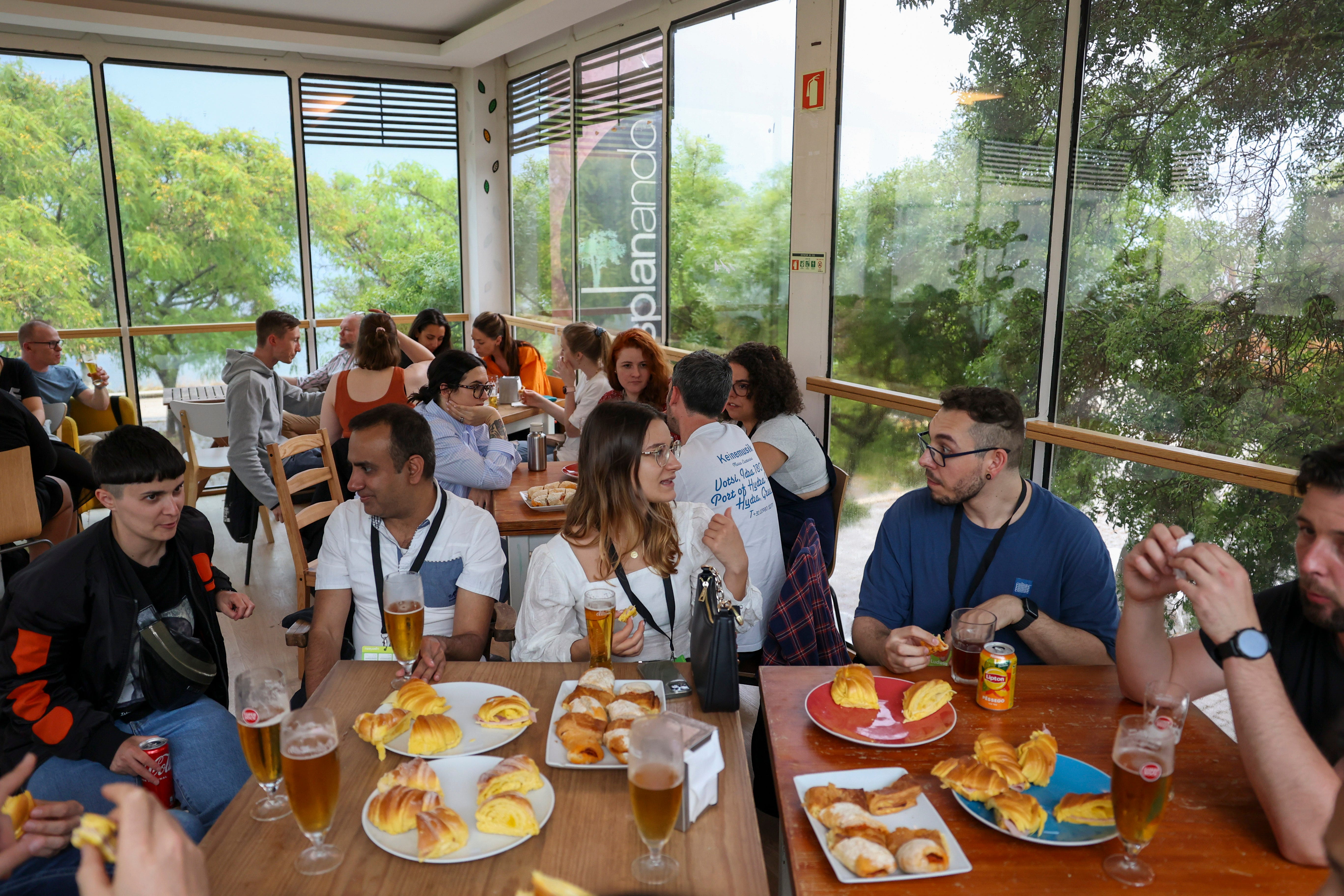
Welcome Party @ Esplanando
The rain and thunderstorm that stroke right after the end of the workshops day forced us to slightly change the after party we had planned. Instead of a nice and sunny terrace we had to move indoors. But great view, chats and free drinks and bites anyways. 😉
24 MAY
🕘 Morning:
- [Re]Designing Strategy, Nathan Shedroff
- Data Visualization for UX, Thomas Watkins
- Designing Complex, Trustworthy Experiences, Carol Smith
- Designing Innovative Products and ServicesIdeation and Prioritisation Methods, Zuzana Peskova
- Designing Effective Search Experiences, Noreen Whysel
🕑 Afternoon:
- Designing Teams to Thrive, Chris Avore
- Psychology to Build Better Products, Jon Yablonski
- Accessibility for Designers, Stéphanie Walter
- Sketching for Visual Thinking, Eva-Lotta Lamm
- Content Research for User Experience, Erica Jorgensen
[Re]Designing Strategy by Nathan Shedroff
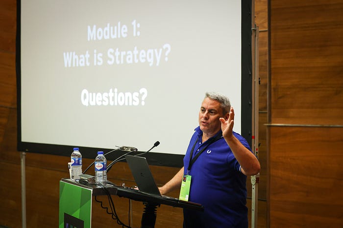
Nathan Shedroff introduced the process and tools of Continuous Strategy, a clear, easy process improvement for any designer to practice and use.
This new approach corrects many of the mistakes of traditional strategy, places design research in the key position of customer/user/constituent insights, and focuses on both qualitative and quantitative value across all stakeholders, internal and external.
It is a framework to better understand both the market and operational context in any situation and prioritises the development of the best value for everyone — including the planet.
Data Visualization for UX by Thomas Watkins
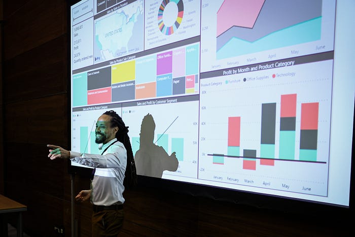
This workshop was meant for everyone looking to expand their design skillset by learning how to visualise data for optimal communication.
The design psychology of data visualisation, how to apply what we know about the human perceptual system, what each chart type is good at and bad at achieving were some of the topics covered. Thomas also shared some tools and showed where they fit in the data visualisation process.
Designing Complex, Trustworthy Experiences by Carol Smith
The lack of research when developing emerging technologies (such as a ring-security camera, digital thermostats or voice assistants) has led to products that show racial or gender bias. A question then emerges — How can we design trustworthy systems?
We can work towards identifying our natural biases — Although not inherently bad, they may be misapplied. We try to manage and change biases, by giving them a purpose and reduce unintended and/or harmful bias. As a team, we can promote conversations for understanding to define what we value, who could be hurt, and what line we don’t want our AI to cross.
Trust is complex, transient and personal. Trust is a psychological state — we use evidence to determine risk and trust is gained when we have enough confidence in positive outcomes. Our trust is calibrated based on the personal experiences, the context and the available evidence of the AI system’s capability and integrity.
Carol presented a UX framework for designing trustworthy AI. An AI that is accountable to humans, cognisant of speculative risks and benefits, respectful and secure, honest and usable.
“Just because you can, doesn’t mean you should.
Create AI systems that are safe and appropriately trustworthy”.
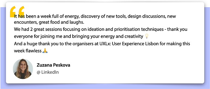
Designing Innovative Products and Services — Ideation and Prioritisation Methods by Zuzana Peskova
Zuzana shared some useful ideation and prioritisation methods that can help designers tasked with coming up with new and innovative solutions.
She started by explaining how we can leverage behavioural science to ideate new solutions:
- Define the world that you want — the ultimate behaviour you want to create (behavioural statement);
- Observe the world we have — understanding why people are/are not doing that behaviour already (promoting and inhibiting pressures);
- Design the bridge between — start ideation interventions that will begin to move identified pressures;
- Test that it works — Evaluate your impact through behavioural metrics.
To practice this methodology, we conducted a series of exercises that included drafting a behavioural statement, pressure mapping (to think of promoting and inhibiting pressures), rapid ideation (how you would increase or decrease a pressure), idea refinement (refine a cluster of ideas), and idea evaluation (based on impact and effort).

Designing Effective Search Experiences by Noreen Whysel

How can we improve the search interface to make search more effective? That’s what Noreen Whysel flew all the way from Brooklyn, New York, to teach us about. She started by talking about the problems users face when conducting searches online and introduced the curious concept of “Google Gullibility” — users are at the search engine mercy and mainly click on the top links, which are often not what they really need. We also covered relevant concepts such as sense-making, information scent, mental model, wayfinding and visual frameworks.
Noreen also made the interesting point that if we build an accessible design we’ll also be solving many search problems.
We got hands-on on a series of pairs/group exercises where we had to observe the user’s search of a topic and map their search behaviours and document the actions taken. Those search behaviours can be narrowed down into three categories: Navigational Search (find something), Informational Search (learn something) and Transactional Search (do something).
In order to design effective search strategies we took advantage of three procedures — empathy map (to help us understand how the user might think and feel about the search), personas (who is searching and what are their goals, needs and frustrations), and Jobs To Be Done (actions a user can make on the website).
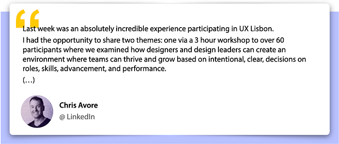
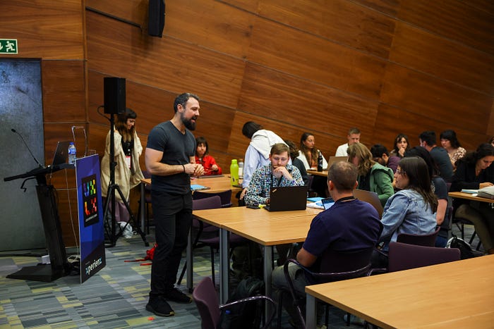
Designing Teams to Thrive by Chris Avore

Chris Avore workshop focused how we can build a leadership that is achievable with a secure, stable, and resilient foundation.
We examined several pillars of a high performing design team where designers, researchers, and content professionals can grow and thrive, and explored elements of role clarity, career ladders, and growth plans so that our team knows its path forward.
We discussed how to define and share what good — and exceptional, and unacceptable — looks like relative to how the rest of our organisation rates performance and talent.
Finally, we also reviewed how much time and energy our teams should be doing what tasks, and how to weight those tasks when giving feedback and evaluating quality.
Psychology to Build Better Products by Jon Yablonski
Jon Yablonski is the writer of Laws of UX — Using Psychology to Design Better Products and Services where he explores the principles from psychology most useful for designers. For this 3-hour workshop he focused on four of those principles — Jakob’s Law, Hick’s Law, the Peak-End Rule and the von Restorff Effect.
It was also interesting to get Jon’s angle on the designer’s power and responsibility, by showing us how technology can shape human behaviour (infinite loops — auto-play on videos, for example).
John also showed how certain metrics (such as Daily Active Users or Time on Page) are successful for the business not the user. Instead we need to focus on why users are behaving a certain way or on how the product is impacting their lives.
“Make more responsible design decisions.”
We then moved to the hands-on part of the workshop to apply what we’d just learned. Everyone collaborated in Figjam where, using a fictional company, we practiced how to align with the design principles.
💡 Head to the Laws of UX website and find out the collection of best practices that designers can consider when building user interfaces.

Accessibility for Designers by Stéphanie Walter

Accessibility is without a doubt a hot topic in the UX field. Just as it should! Stéphanie Walter’s workshop couldn’t be more relevant for everyone designing and shipping interfaces to this ever-demanding and diverse market.
For the very first part of the workshop, Stéphanie started by laying down the grounds of accessibility, explaining what accessibility is, the different kind of disabilities, how people navigate the web with assisting technologies, and what the WCAG is. Then she shined a light on how and where designers can have an impact on accessibility, by providing best-practices and examples, specifically in 4 different quadrants:
- Visual Design — usage of colours, text and non-text contrast, documenting accessible color combinations, text resizing an typography;
- Content Access — image and icons, video and audio content, screen orientation);
- Interactions — buttons and links, forms and inputs, complex component interactions);
- Way-finding — in-page navigation, semantic order for navigation, navigation across pages.
“Why fix it, when you could design and build it right to start with?”
💡Check this out! Stéphanie keeps a blog on accessibility for designers where she shares resources, checklists, and tools to help all designers build more accessible products.

Sketching for Visual Thinking by Eva-Lotta Lamm

Eva-Lotta Lamm delivered a hands-on workshop where we built a practical foundation for a thoughtful sketching practice. She proved how sketching is a powerful skill that can be applied to think through complex problems, iterate through different solutions and engagingly explain ideas.
Eva-Lotta shared some techniques for a clear and confident line, and we where able to practise sketching objects, people, actions and emotions.


Content Research for User Experience by Erica Jorgensen

Having recently published the book Strategic Content Design (April 2023), Erica Jorgensen had much to share with us.
We digged into content research and why it can be so effective to improve our content and UX, and ultimately drive business results. Erica explained how content research can be separated from design research, and what content we should do research on — terminology, voice & tone guidelines and content-design components, style guides, and specific user experiences.
She showed us how results and insights can and must be documented (by creating a content research repository, for example).
The real-life examples of content research in action and how it dramatically influenced several websites and products were really helpful to make topics clearer.
“Testing the words by themselves is stunning.”
Eating, drinking & networking
With so many insights to soak in, coffee and lunch breaks always come very handy. All we had to do was exiting the workshop room and there it was — a buffet lunch with some very typical Portuguese flavours, including codfish, chorizo, a variety of cheeses, just to name a few.

We also like to throw in some surprises during afternoon coffee-breaks, which included some delicious artisanal ice-creams and the most famous cream custard tarts — Pastéis de Belém.
Always nice to keep the networking going over great food! 😉


And this year — a bonus book fair 📚
This year some of our speakers who are also published-authors put together a little stand where they would sell or sign their books (with a special discount for the event) or simply share some thoughts with UXLxers.

25 MAY
🕘 Morning
- Psychology to Build Better Products by Jon Yablonski (Round 2)
- Systems Thinking for Designers, Sheryl Cababa
- Storybuilding: Using Story in UX, Stefan Mumaw
- Measuring Emotional Engagement, Bill Albert
- Designing Experiences using Theatrical Methods, Adam Lawrence
🕑 Afternoon
- Designing with AI, Chris Noessel
- Designing Innovative Products and Services — Ideation and Prioritisation Methods, Zuzana Peskova (Round 2)
- Design Debt — Manage & Use Strategically, Alicja Suska
- Accessibility for Designers, Stéphanie Walter (Round 2)
- Content Research for User Experience, Erica Jorgensen (Round 2)
Systems Thinking for Designers by Sheryl Cababa

Sheryl shared some practical tools and frameworks for how to use systems thinking concepts to strategically shape our design approach.
The workshop covered the intersection of systems thinking and design thinking, the structure of engaging systems thinking and design frameworks, and use cases for engaging in systems thinking through design.
In groups and using case studies, we worked through a series of scenarios. First we had to unpack the status quo and root cause and then use the systems thinking framework to address the problems within the scenarios provided.

Storybuilding: Using Story in UX by Stefan Mumaw
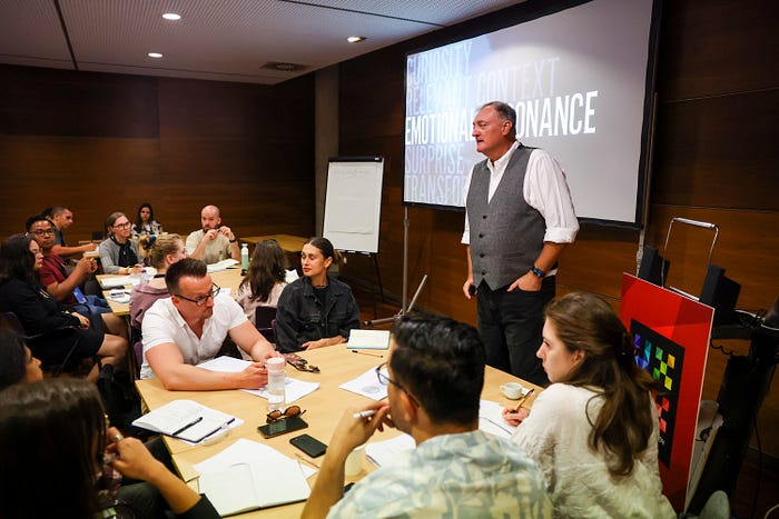
“You guys are all storytellers.”
That’s exactly what Stefan Mumaw spent this 3-hour workshop showing us. Moreover, Stefan showed us how we can be storybuilders. We dived into the Five Part Story Structure, and how by following the structure we can convert static information (like data from a report) to a dynamic story form (one that people can feel and understand).
But how can we make a structured story into a good one?
- Curiosity (what draws people in);
- Relevant Context (empathy, for people to care the story has to be relevant for them);
- Emotional Resonance (know what trigger to pull);
- Surprise (the pay off for curiosity; caused by change, without change a story is simply a succession of events, it becomes dull);
- Transformation (change that altered something, usually by the hero).
By watching some real-world examples we were able to better understand how each story component is used to build an emotional bridge between people and the things we build.
“Stories make you remember information.”
Finally, we got hands-on and tried to apply the 5-Part Story structure to create an interesting story that communicates a finding and a recommended solution.


Measuring Emotional Engagement by Bill Albert

Bill Albert brought us a workshop to help us identify and measure relevant emotions while a user is interacting with our product or service.
Bill shared a set of practical tips on how to measure the emotional user experience, including how to collect and analyse data, a review of the latest technologies, mistakes to avoid when measuring emotion, and how to consider time and budget constraints. We also covered topics such as facial expression analysis, eye tracking, self-reported metrics, use of emojis, GSR, and more.
The tools and methods we learned can certainly help us to create user experiences that touch people in more meaningful ways.

Designing Experiences using Theatrical Methods by Adam Lawrence
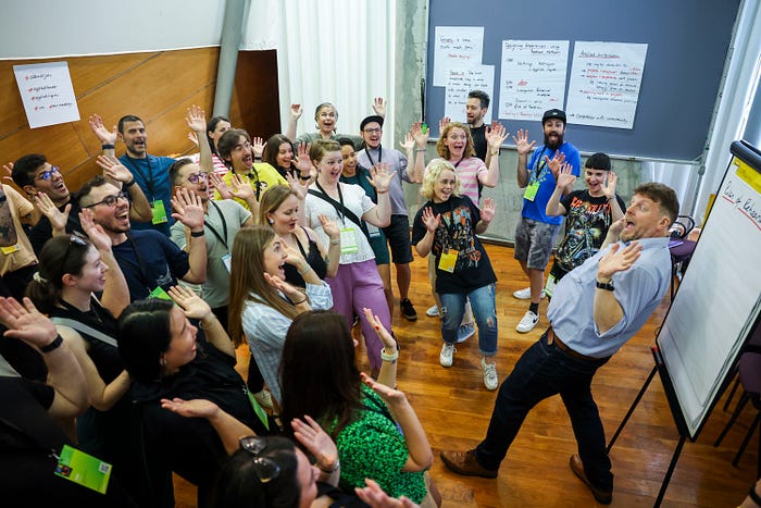
Using his experience of theater, film and storytelling, Adam Lawrence connects the worlds of business and showbusiness. For this very practical workshop he introduced us with some basic theatrical techniques and showed how they can be applied to UX or other design projects, whether in research, ideation, prototyping, or as tools for collaboration in teams.
“In this workshop at the #UXlx conference in Lisbon, I introduce a wonderful group of around 50 participants to theatrical tools we can use in #UX #CX #ServiceDesign. We looked at using #AppliedImprov techniques to explain and train both mindsets and practices, as well as to work directly on challenges in research, ideation, prototyping and implementation. We dove deeper into #InvestigativeRehearsal, which is a powerful adjunct to (or replacement for) #wireframing. And we had fun exploring the #DramaticArcs of experiences — the secret of rock and roll.🤘 (…)


Designing with AI by Chris Noessel

Although narrow AI can seem overwhelming, Chris Noessel made us see how the basics of AI can be simpler than we think. He also laid down the importance of getting familiar with the material in which we are designing, so you we can match the material with the users goal as best as we can.

Design Debt — Manage & Use Strategically by Alicja Suska
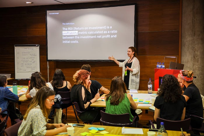
Alicja Suska started by defining the concept of Design Debt:
Design debt is the sum of all the imperfections of the user experience and design processes that appear over time as a result of innovation, growth, and lack of design refactoring.
How can organisations know if they are on Design Debt?
- Slow growth;
- Reduced adoption & customer satisfaction;
- Low team velocity (domino effect);
- Difficulties in accommodating new features;
- General team dissatisfaction.
Alicja explained how Design Debt can be used to create strategic advantages for the company regarding innovation, escaping linear growth, and conducting experiments.
We had the change to practice by creating a business case for the real-life Design Debt project.
“Last week’s UXLx: User Experience Lisbon was incredible! 🚀 I had the opportunity to conduct a workshop about Design Debt for the most amazing and engaged group of participants 🙌
We discussed getting the buy-in for your next Design Debt project — from good practices to addressing the most common objections ❌. (…)”
26 MAY
Get to know more about the Talks day at UXLx 2023 in the article “UXLx 2023 — Wrap Up — Talks day”.
After Party @ Carmo Rooftop
After 4 days of intensive workshops we could all use a chance to lighten up a bit, giving both attendees and speakers the change to keep networking only now in a more relaxed setting.
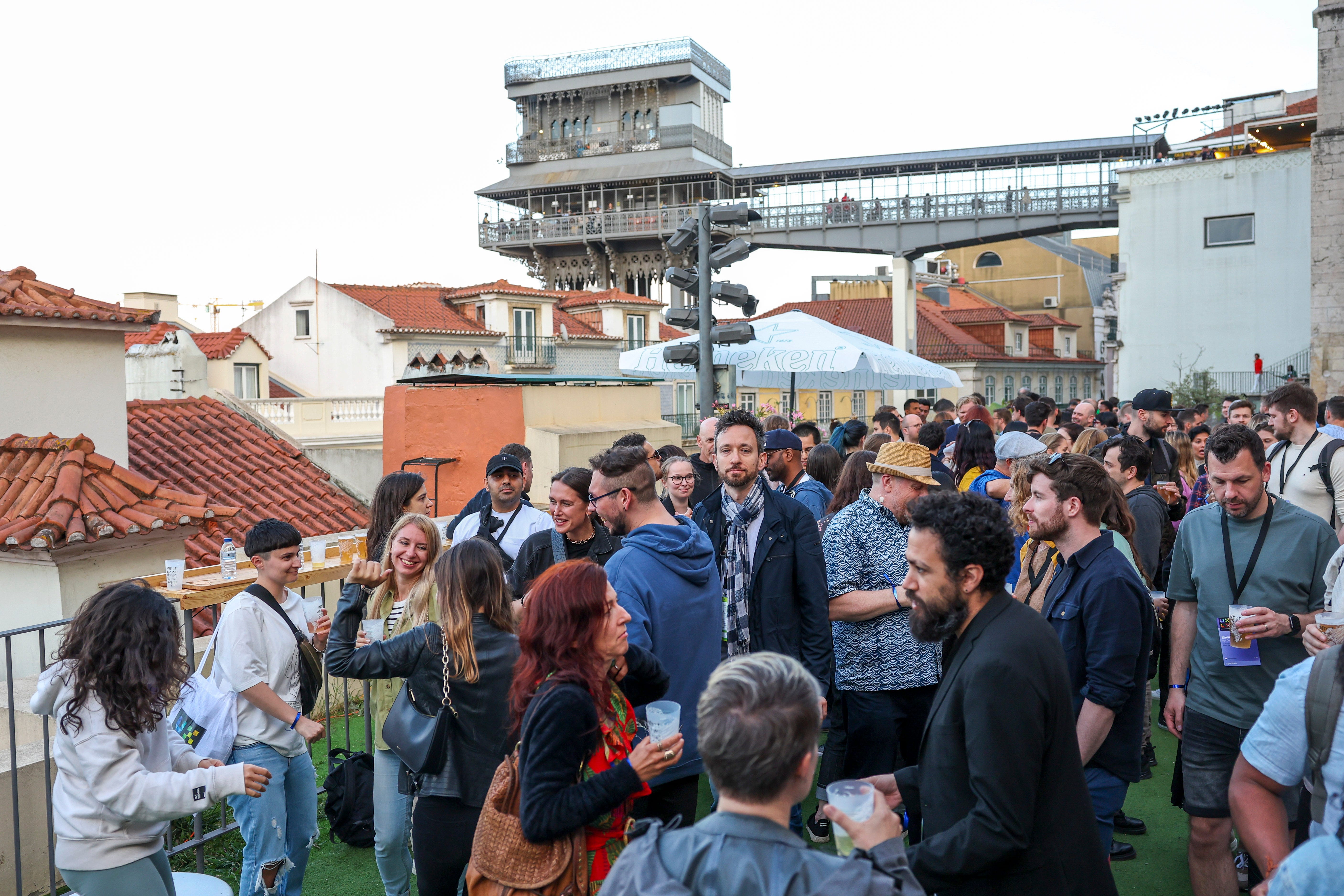
After a tour in panoramic buses from Parque das Nações to Baixa (downtown), we ended up in a rooftop overlooking Lisbon’s downtown, with drinks, snacks and sunset vibes music. 🍻🥪💃 Could there be a better setting to end this year’s awesome edition?

🙌 Last but not least, we’d like to thank…
- … our Gold Sponsors Balsamiq and Readymag, and our Partners for their support.
- … our incredible speakers who so passionately shared their knowledge.
- … the hundreds of attendees from all around the world who chose UXLx to help them become better at their craft.
- … our photographer José Goulão for brilliantly capturing the essence of our event.
- … the entire UXLx team who always goes all out to bring the best UX content to sunny Lisbon and give everyone an incredible experience.


